
Context
As Elev808 expanded their product catalog beyond its core sports apparel offerings, the storefront required a structural lift. This included new page templates, expanded collections, and a more scalable site architecture to support a growing and more diverse product range. This expansion provided the opportunity to address additional underlying UX issues.
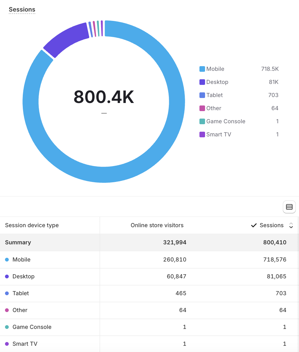
Sessions by Device - Mobile over Desktop
Driven by Data
Before making any design decisions, we first had to understand how our customers are accessing the site. Based on session data by device type, we saw that almost 90% of our customers were accessing our site via mobile. A mobile-first approach was not just a best practice, but a data-backed necessity.
For every layout decision, each page for the redesign was evaluated through the mobile experience lens first and with desktop treated as a secondary priority.
The Audit
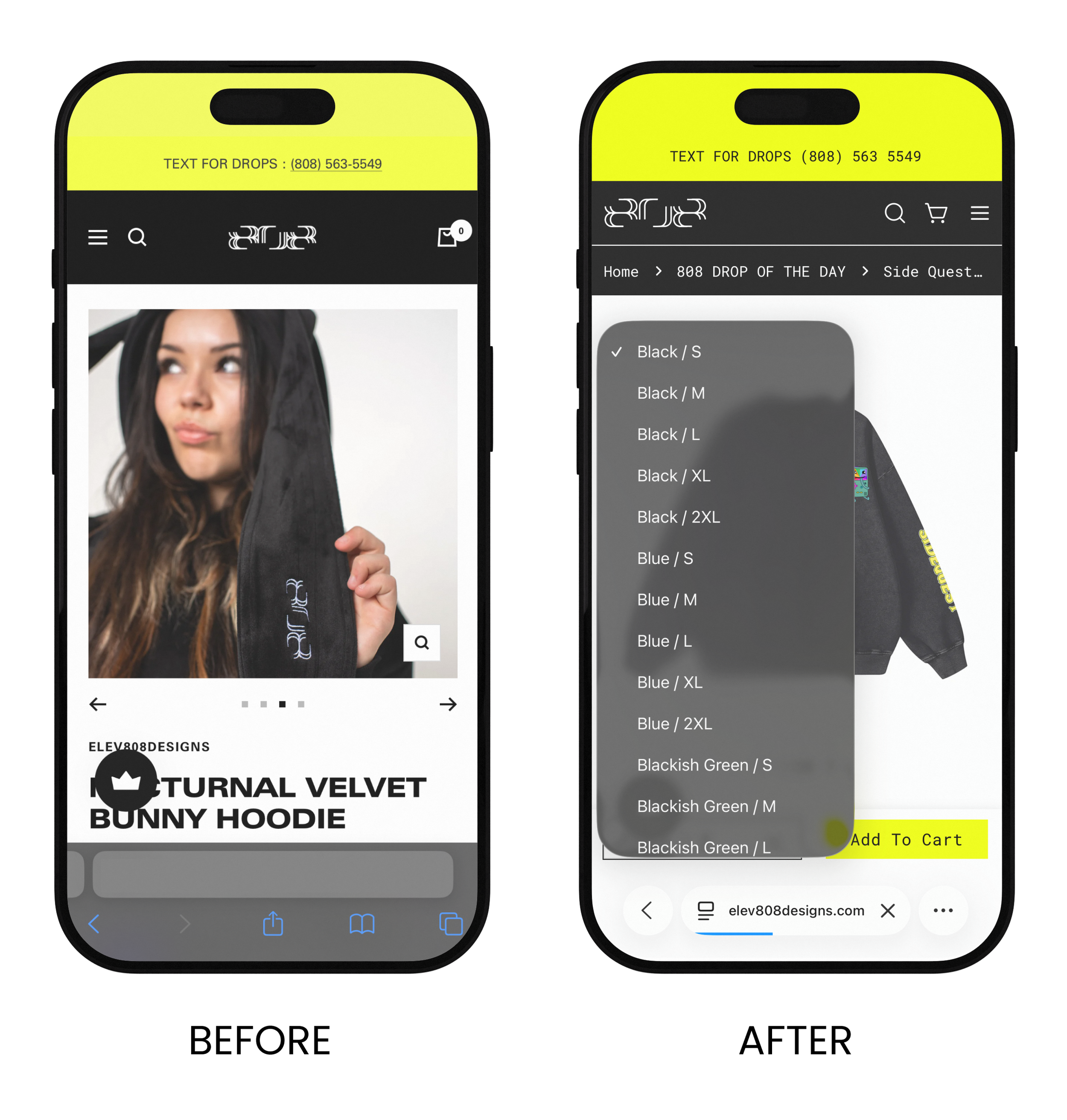

Product Pages — Persistent Call to Action
Before: When users landed on a product page, only the product images and name were visible above the fold. To reach the variant selector and Add to Cart button, users had to scroll past the full product description — creating unnecessary friction at a critical point in the purchase journey.
After: We introduced a sticky Add to Cart bar that remains visible as the user scrolls, ensuring the primary conversion action is never out of reach. We also restructured the information hierarchy so that pricing and variant selections appear before the product description, reducing cognitive load and shortening the path to purchase.
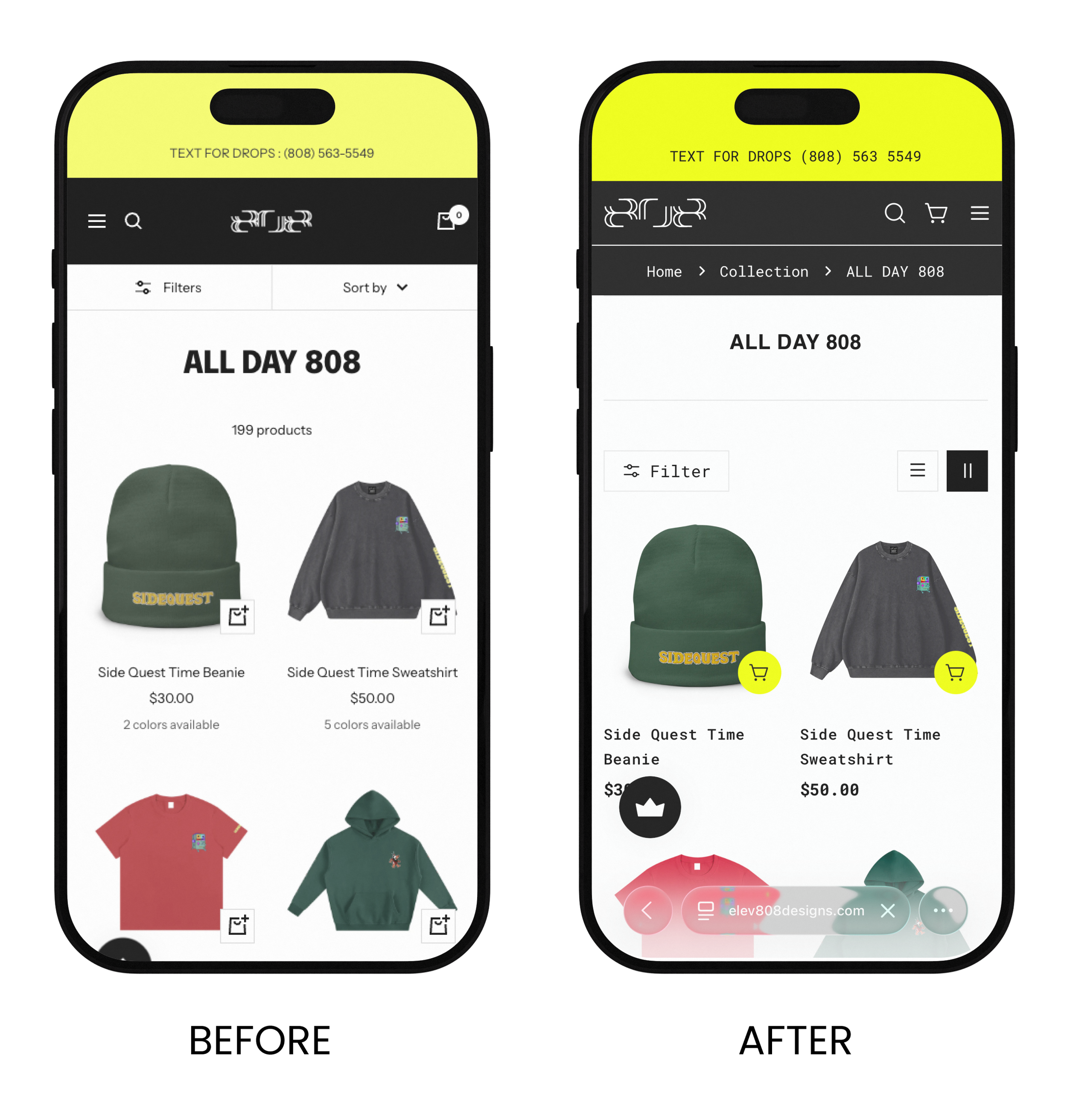
Collection Pages — Mobile Sub-Navigation
Before: On desktop, breadcrumb navigation allowed users to orient themselves and move freely between page levels. This was absent on mobile — a significant UX gap that increases disorientation, raises bounce rates, and discourages deeper exploration of the catalog.
After: Breadcrumb navigation was reinstated as a priority across all breakpoints and contexts, including within individual product pages. The placement — directly below the main navigation bar — was standardized across both desktop and mobile to ensure a consistent and predictable experience.
Collection Pages — Browsing Experience (Scrolling)
Before: Collection pages used pagination to segment product listings, which interrupted browsing flow and created unnecessary drop-off points — particularly problematic as the catalog continues to grow.
After: Pagination was replaced with infinite scroll, enabling a seamless, uninterrupted browsing experience. This supports higher engagement and better discoverability, especially as new products are added to the catalog over time.
Post Design Analysis
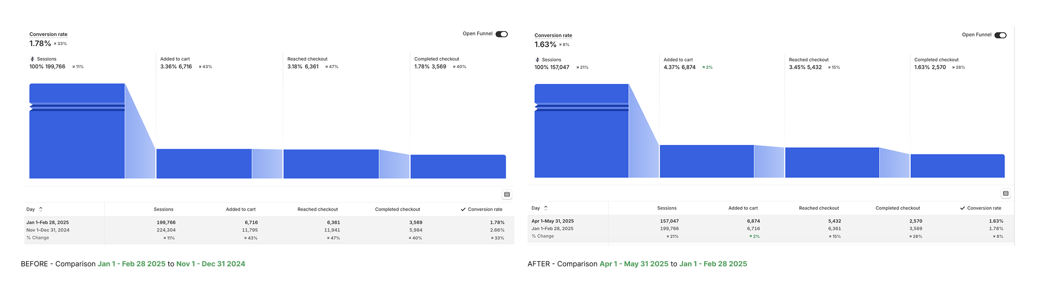
The Jan/Feb before the redesign, sessions fell 11%, but more critically, add-to-cart dropped 43%, checkout dropped 47%, and completed checkouts dropped 40%. This is a combination of the post-holiday season AND likely the pre-redesign store experience.
The Apr/May recovery after the redesign, we see that sessions dropped another 21%, however the add-to-cart rate actually increased from 3.36% to 4.37%. which is notable since the Nov/Dec period is when purchase intent is naturally at its peak due to the holiday season.
We also see that Reached Cart checkout increases slightly as well from 3.18% to 3.45% indicating that the redesign improved product discovery and purchase intent. However we do see the conversion drop at Completed Checkout. It is important to note the macro factors including external economic pressure (tariffs, consumer spending pullback in spring 2025 were well-documented) and reduced overall traffic volume from a quieter seasonal period.
The key insight to highlight is: fewer people came to the site, but a noticeable proportion of them engaged meaningfully with products.